Introducing Our New Cosco Kids™ Brand Identity
Objective: Create an identity that separates Cosco Kids™ from the competition and communicates the emotional connection and meaning behind our Brand.
In 1935, Cosco started as the Columbus Specialty Company in Columbus, Indiana, USA. For over 80 years, Cosco Kids has supported families with great children’s products at great prices. But with rapid shifts in retail and increasing fragmentation of the marketplace, we needed to evolve our brand and communications in order to reach our goals of expanding our assortment and creating a stronger connection with consumers.
After nine months of extensive research, we identified our challenges and objectives and set out to reinvigorate and modernize this heritage brand while keeping the essence our consumers know and love.
Before we ever pushed a pixel on the screen or started to write a narrative, we dove deep into collected insights, both demographic and psychographic, read hundreds of reviews, spoke directly with our consumers, walked department store aisles, researched our competition, brought our products home, and performed quantity and quality testing.
Then did it all again.
Building a New Identity
We approached the rebranding process with the intention of revitalizing the Cosco brand, but remaining true to our core values.
The Mandatories
-
Elevate the expression of the brand, while building on the equity we already have.
- Engage expanded families in a more human and real way, through conversations that matter to them and by demonstrating empathy for their needs and perspectives.
- Cultivate a sense of ease in both brand and product interaction to create easy connections and long-term relationships.
- Stand-out on a retail shelf (in person, in stores) and e-comm (e.g., Amazon) in an iconic way that matches our personality, presence, and reputation.
Brand Pillars
When redefining Cosco as Cosco Kids™, we were thoughtful and deliberate in establishing our new Brand Pillars. From the visual look and feel to the sound, tone, and brand voice, our pillars are the foundation of who we are and how we present ourselves to our customers.
Make it Move
Bring the Realness
Iconic with Purpose
Keep it Simple
Shout Out the Whole Village
Surprise and Delight
Design Overall
The visual identity of Cosco Kids™ embodies the idea of bringing elements together to create a vibrant tapestry. To do this, we carefully curated the logo, typography, color palette, graphic elements, and overarching identity system to be as energetic and engaging as the brand itself. The visual identity is literally built from our logo––using differing shapes that create motion, and layering graphic elements to form dynamic compositions, our branding truly celebrates the rhythm of Cosco Kids™ families.
This rhythm flows through all creative touchpoints using playfully expressive and “perfectly imperfect” lifestyle photography as well as fashion-forward product photography in unique ways. When woven with our graphic elements, we create a beautiful, lively canvas to connect with our consumers. Our ads, whether they’re lifestyle or static, are immersive and engaging, and feature images and positive language that capture character, attitude, and motion, showcasing .our consumers’ entire village and candid connections that connect to real families.
Logo
One of the first elements to get a refresh was our logo. The old logo was dated, and lacked the motion that’s inherent to our redefined Brand DNA. As we thought about the brand’s visual language, we realized we needed something more substantial to command attention and step forward, away from any background graphic noise.
And just like that, Cosco became Cosco Kids™.
The evolution from Cosco to Cosco Kids helped not only differentiate us from the US-based retailer, Costco, but plays up the fun and spontaneity of our brand. And an added bonus – our new name now aligns with our existing Cosco Kids website URL.
New Logo
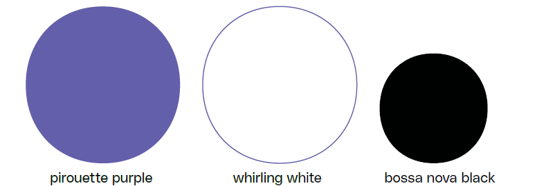
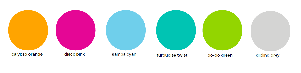
Color Palette and Typography
We leaned into the liveliness and energy of our brand by choosing a vibrant palette of colors, and created usage rules that allow product, fashion, and messaging to come first in hierarchy.
To add personality to our palette, our writers gave each shade a name inspired by dance and movement. These colors aren’t just beautiful and fun, they also differentiate us from competitors and stand out in the juvenile aisle.
In addition to an engaging color palette, the new Cosco Kids™ branding includes a fresh, bold, versatile typeface. This typeface has numerous weights (perfect for establishing messaging hierarchy) and subtle nuances like curves and dips that set it apart it from other san-serif fonts.
Cosco Kids™ Secondary Color Palette
Broader Distribution
In our earliest development stages, we enlisted the help of Team Brazil. Not only did we want Cosco Kids™ to be a success in the US, we wanted to know that the look and feel of the brand would play globally and to ensure that a shift in color palette from blue to purple would be well-received and culturally approporiate. We also did consumer testing to validate our visual direction with consumers—and they loved it.
In order to maintain consistency across all markets, Digital Guidelines have been released with a more robust Brand Book (including Packaging, Merchandising, Retail Experience) to come.
We invite you to visit www.coscokids.com to experience the surprise, delight, and pure joy that is Cosco Kids™.